
creation of the brand identity
My design mentor encouraged me to create a personal brand—something recognizable and true to me. While many designers use their full names, I chose not to. I’ve never felt connected to my last name, so I decided my logo would be built around my initials instead.
After exploring many variations, I chose to merge the two letters into a single mark. The typeface’s elegant curves reflect my brand vision, and I refined them further so the letters align perfectly. The final logo feels personal, intentional, and uniquely mine.

I created a mini brand book to clearly define my brand guidelines and ensure consistency across all design work. It includes logo variations and usage rules, as well as the color palette and typography for both web and print applications.
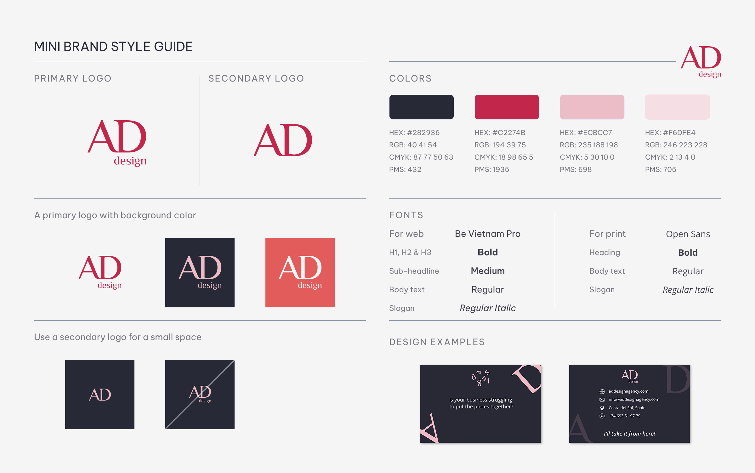
For my print materials, I focused on minimalism and elegance. I used clear, readable typography and a carefully balanced amount of information, complemented by subtle visual elements that reflect my personal identity.

This identity reflects my approach to design: intentional decisions, refined details, and a strong sense of personal expression.