creation of the brand identity
The project: Solura — AI-driven energy optimization startup.
Headquartered in the Málaga TechPark, Solura is a pioneering energy-intelligence startup redefining the relationship between homeowners and the sun. By merging high-performance hardware with a sophisticated AI-driven SaaS platform, Solura transforms standard solar installations into autonomous profit centers.
The goal: transitioning a technical startup from a generic "eco" look to a premium, investor-ready "Energy Intelligence" brand.
Key deliverables: visual identity, logo construction, color strategy, and digital-first brand guidelines.
Solura arrived with a powerful AI technology but a generic visual presence. The challenge was to strip away the 'eco-commodity' clichés and engineer an identity that felt like a high-end energy asset. We needed to build a bridge between the physical hardware (solar panels) and the sophisticated software (AI intelligence) while ensuring the brand was accessible and scalable for a global digital launch.
The name Solura is a strategic synthesis of the Spanish Sol (Sun) and Futuro (Future). It represents a shift from passive energy consumption to an active, AI-driven future where sunlight is managed with digital precision.
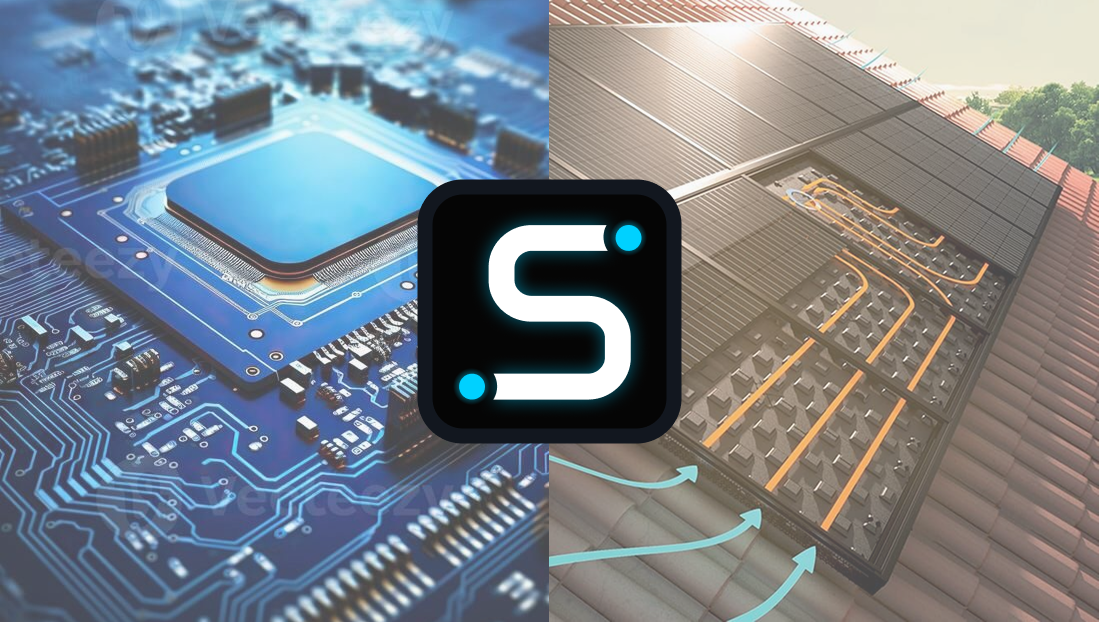
The Solura mark is not a decorative icon - it is a functional emblem of "Energy Intelligence." The symbol - referred to as the S-Chip - is a geometric synthesis of three core elements:
S-Curve: representing the fluid, infinite nature of solar energy.
Semiconductor circuit: Reflecting the AI-driven "brain" behind the hardware.
Energy nodes: The circular endpoints symbolize storage units and the interconnected grid of a smart home."
By merging the organic flow of the sun with the rigid logic of a microprocessor, the logo communicates that Solura is where nature meets engineering."
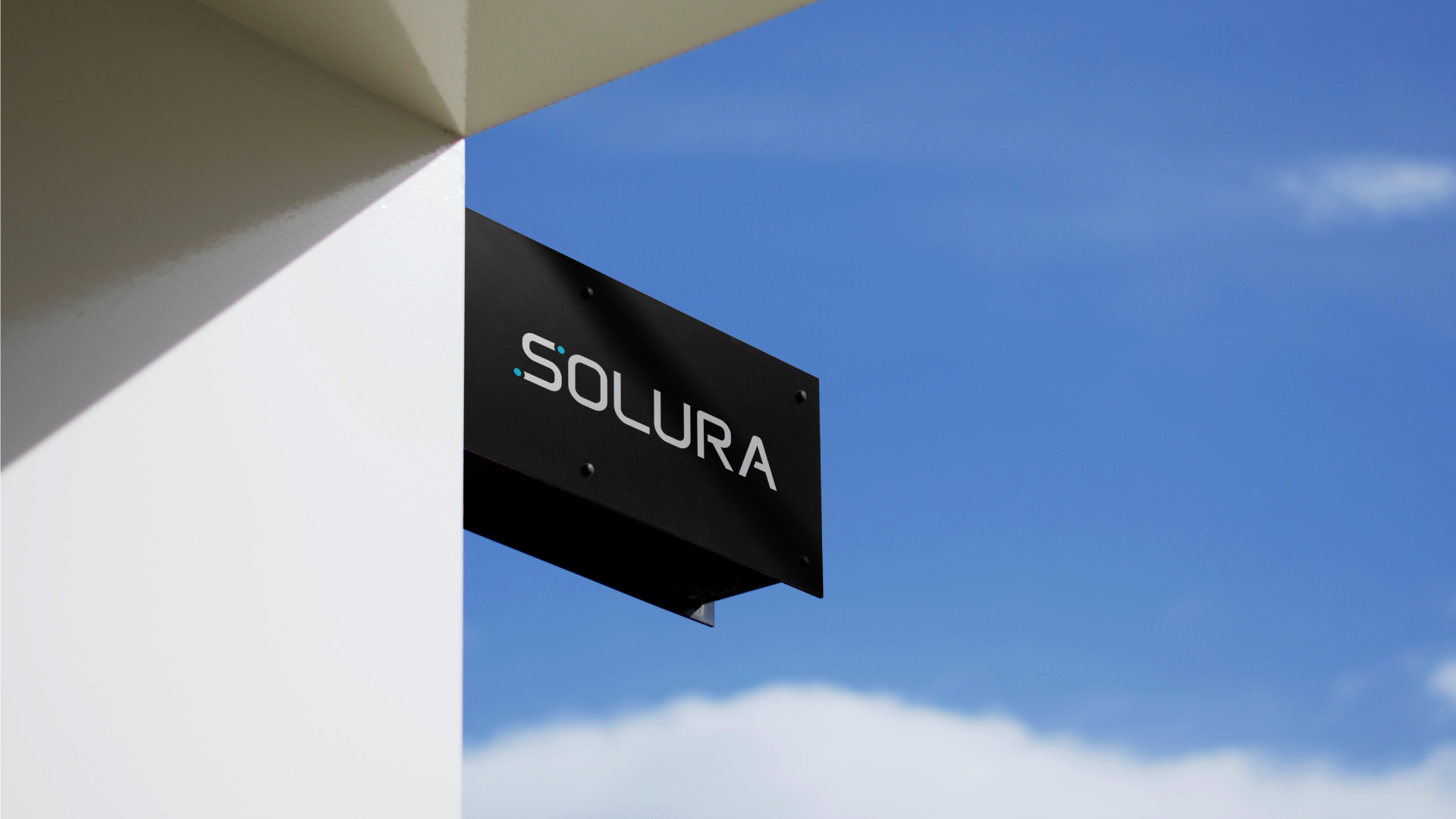
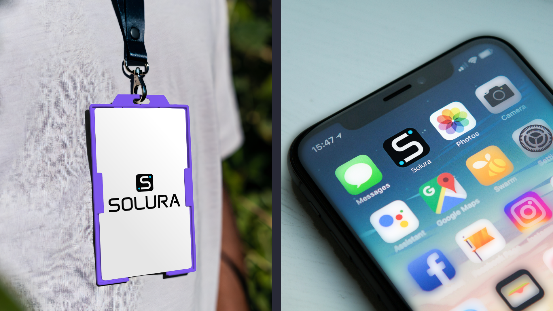
A tech-forward brand must remain recognizable across vastly different mediums. The Solura system was engineered for absolute scalability, ensuring that the "S-Chip" maintains its visual impact whether it's a 16px favicon or a large-scale architectural installation.
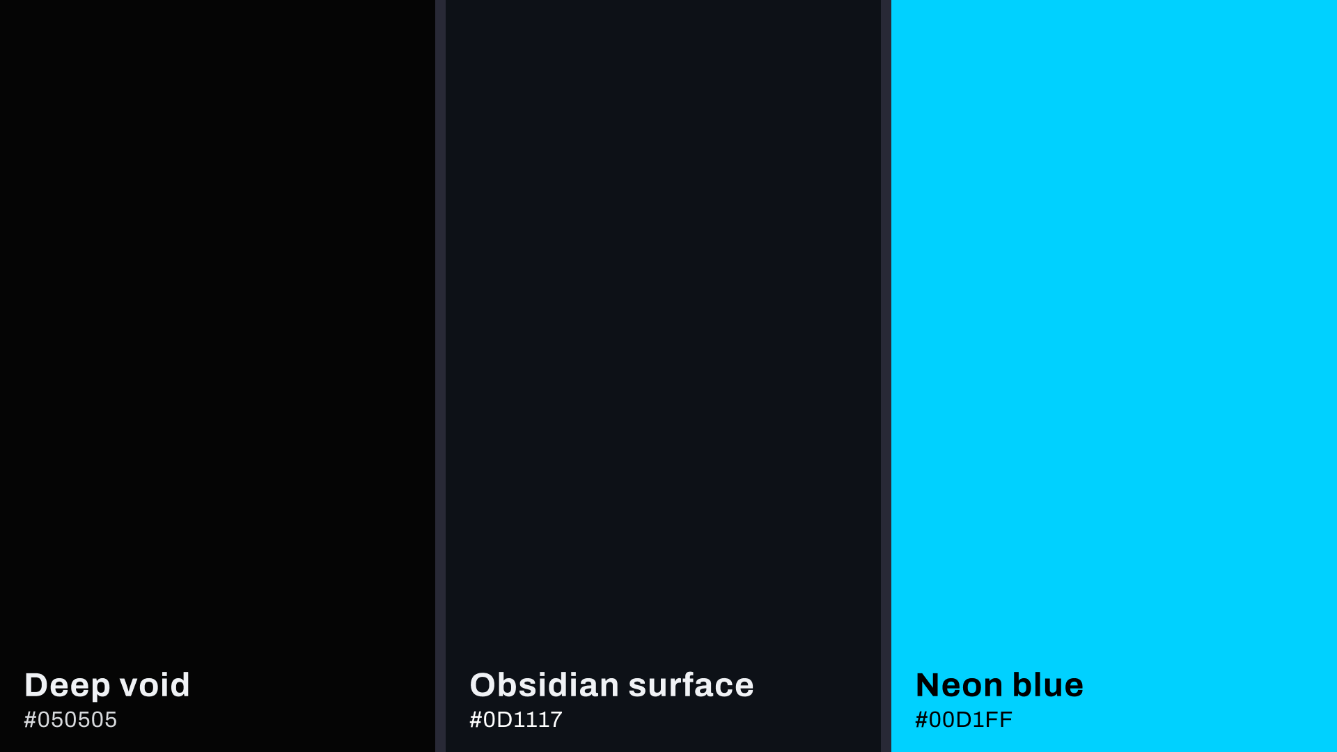
To create depth within a Dark Mode environment, we developed a color system that mimics high-end hardware materials:
Deep void: the primary atmospheric foundation. A near-black navy that eliminates visual noise and anchors the brand.
Obsidian surface: a secondary "material" layer used for cards and UI components. It provides a subtle lift from the background, creating a sense of physical structure and depth.
Kinetic neon: the core energy source. A high-vibrancy blue used exclusively for data visualization and interactive triggers.
This hierarchy ensures that the 'Energy Pulse' of the brand always sits on a structured, premium surface, reflecting the sophisticated nature of AI-managed solar power.
The Solura identity successfully bridges the gap between complex AI technology and premium consumer expectations. By moving away from industry clichés and focusing on a systematic, digital-first approach, we have created a brand that is not only visually striking but strategically positioned for the competitive European energy market. Solura is now equipped with a scalable visual language that projects authority, ensures accessibility, and is ready to evolve alongside its innovative hardware.